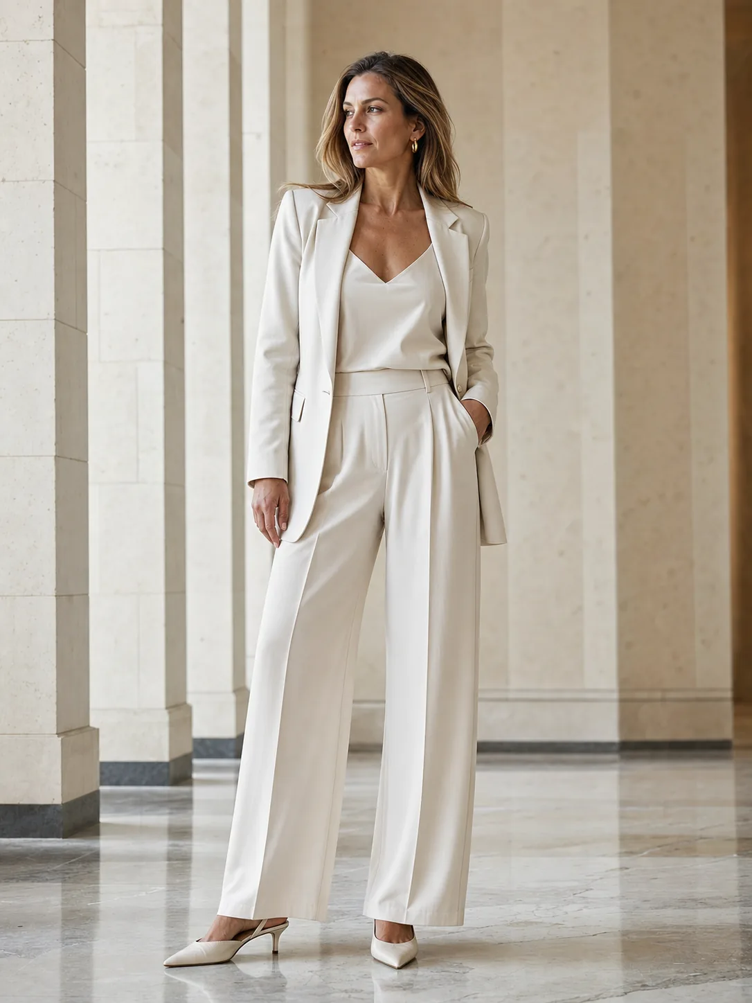
A colour wheel can help, but it is not a dress code. Everyday outfits depend on hierarchy: which colour covers the largest area, which one leads the eye, and which small accent creates tension. Research supports a useful starting point—moderate coordination can be more appealing than either perfect sameness or random contrast.
The case for moderate coordination
Gray and colleagues tested how colour coordination affected fashion ratings. In their controlled stimuli, moderately coordinated outfits were rated more positively than looks at either extreme. The authors described a Goldilocks principle: enough relationship to feel coherent, enough difference to remain interesting.
This is not a timeless law of taste. Culture, skin tone, occasion, trend, silhouette, and textile texture all change perception. Use the finding as a prompt: add one contrast when an outfit feels flat, or repeat one colour when it feels fragmented.
Build a palette with hierarchy
Start with the largest surface—a coat, dress, suit, or trousers. Add a supporting colour, then reserve the strongest contrast for a smaller area. The goal is not a strict percentage formula; it is making the visual order easy to read.
Neutrals also have temperature and intensity. A blue-based grey behaves differently from warm taupe, even when both appear quiet. If a combination feels wrong, compare brightness, warmth, and saturation rather than relying on colour names alone.
- Quiet: navy, off-white, and cognac.
- Fresh: cream, sage, and silver.
- Directional: charcoal, swimming-pool blue, and oxblood.
- Warm: ecru, rust, and deep olive.
Test the whole outfit, not isolated swatches
Photograph the full outfit in neutral light and view it small. A thumbnail makes dominant colour and abrupt visual breaks easier to notice. It also reveals when several near-neutrals have conflicting undertones.
An AI try-on can help you compare broad colour and proportion ideas, but it can alter hue, fabric, and detail. Confirm the actual product in retailer photos, daylight, and—when possible—a physical fitting.
THREE THINGS TO REMEMBER
- Aim for coherence plus one intentional contrast.
- Judge colour by area, temperature, brightness, and texture—not names alone.
- Use photos and previews for direction, then verify the real garment.
Questions and answers
How many colours should an outfit contain?
There is no scientific maximum. Two colours and a neutral are an easy starting point, but hierarchy and repetition matter more than a fixed count.
Must shoes and a bag match?
No. They can relate through temperature, material, formality, or a repeated accent without being identical.
How can I combine two strong colours?
Keep silhouettes and other details quieter, separate large colour areas with a neutral, and check the entire outfit from a distance.
Sources and references
- Kurt Gray, Peter Schmitt, Nina Strohminger, Karim S. Kassam (2014). The Science of Style: In Fashion, Colors Should Match Only Moderately. PLOS ONE. DOI: 10.1371/journal.pone.0102772
Limitation: The experiments tested ratings of controlled outfit stimuli. They do not establish a universal rule across cultures, occasions, textures, or changing fashion trends.